Unlocking Insights: The Benefits of Using Charts in Data Analysis
Using charts in data analysis offers several benefits that can help unlock valuable insights from your data. Charts are graphical representations of data that can make complex information more understandable and accessible. Here are some of the key benefits of using charts in data analysis:
1. Visualization of Data:
Charts provide a visual representation of data, making it easier to understand patterns, trends, and relationships within the data. Visualizations help analysts and decision-makers quickly grasp the significance of the data.
2. Identification of Trends:
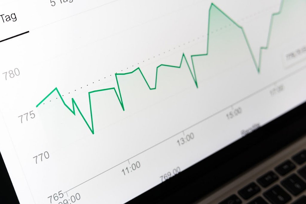
Line charts and time series plots can reveal trends over time, such as increasing or decreasing patterns. By visually displaying data over a period, you can identify long-term trends and anomalies.
3. Comparison:
Bar charts, scatter plots, and other visualizations allow for easy comparison between different data points or categories. This helps in assessing the relative sizes, values, or performances of various elements in the dataset.
4. Pattern Recognition:
Charts can highlight patterns and clusters within the data. For example, scatter plots can reveal clusters of data points that might indicate specific groupings or relationships.
5. Anomaly Detection:
Visualizations can make outliers or anomalies in the data more apparent. These outliers may indicate errors, anomalies, or important insights that warrant further investigation.
6. Storytelling:
Charts can be used to tell a data-driven story. By combining different types of charts and visualizations, you can create a narrative that communicates the key findings and insights from your data analysis effectively.
7. Simplification:
Charts simplify complex data by representing it in a visually digestible format. This simplification can be especially useful when presenting data to non-technical stakeholders or the broader team.
8. Data Exploration:
Charts facilitate data exploration. You can interact with them to zoom in on specific data points, filter data, or drill down into details, allowing for deeper exploration of the dataset.
9. Decision Support:
Visualizations help in making informed decisions. Whether you’re comparing options, tracking progress toward goals, or evaluating the impact of a decision, charts provide a clear basis for decision-making.
10. Improved Communication:
Visualizations are a universal language that can be understood by people with varying levels of data literacy. They enable effective communication of data insights across teams and organizations.
11. Hypothesis Testing:
Visualizations can aid in hypothesis testing by allowing you to see whether your data aligns with your expectations or hypotheses. If there’s a significant deviation from the expected pattern, it can prompt further investigation.
12. Forecasting:
Time series charts and trend analysis can be used for forecasting future trends and making predictions based on historical data.
13. Monitoring and Alerts:
Real-time charts can be used for monitoring key metrics and setting up alerts for when certain thresholds or conditions are met, allowing for proactive decision-making.
In summary, using charts in data analysis is a powerful technique that offers numerous benefits, from simplifying complex data to aiding in decision-making and communication. Whether you’re exploring data for insights, tracking performance, or presenting findings to others, visualizations are an essential tool in the data analyst’s toolkit.


Post Comment